

ZOE GOLDTHORPE
Learning Design Lead
How do you write a plan for a lesson with 6,561 possible combinations?
Right from the very start of our design process, when our PSHE lessons were little more than notes on a whiteboard, we knew that customisation was a key element. We wanted to give teachers choice.
That’s how we ended up creating a lesson structure where teachers can pick and choose from 24 different activities to create a full lesson that suits their class, their context, and their style of teaching.
With a couple of clicks, one of our lessons can be picked up by two different teachers, customised, and taught in two completely different ways – whilst still covering the same content and meeting the same learning outcome.
The problem with this? Our design means that there are 6,561 possible activity combinations per lesson. And how, exactly, do you write a lesson plan for that?
How do we want a teacher to feel when they open one of our plans?
Our learning design team is made up of experienced teachers, and I don’t think it’s an exaggeration to say that we’re all a little haunted by memories of long evenings spent putting together detailed lesson plans that often took longer to write than the lesson took to teach.
We also remember how those plans were rarely designed to help us in the classroom at the point of teaching: when you’re in the middle of a lesson, surrounded by children, managing behaviour, giving an explanation, navigating the interactive whiteboard, keeping an eye on the time, and differentiating an activity six different ways, the last thing you need is to be desperately hunting through a document for a bullet point hidden on page seven.
So, we wanted something different. Something practical. Something teachers would want to use, because it helped them feel confident and in control.
What does a teacher actually need to see during a lesson?
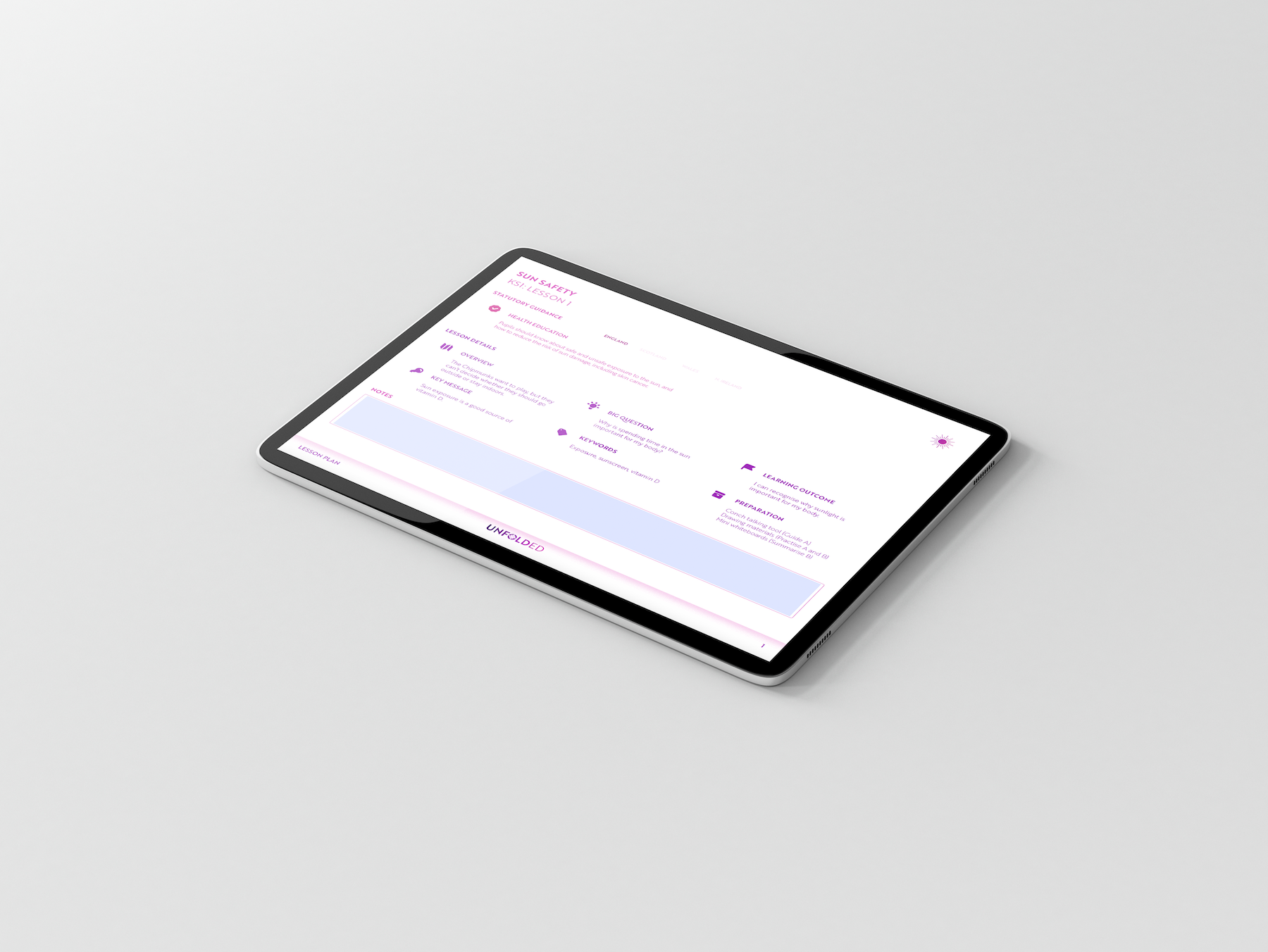
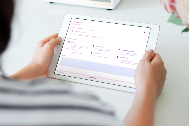
Between drawing on our own experiences and trawling through examples of lesson plans online, we found we kept coming back to the same phrase: ‘at a glance’. Our lesson plan layout had to be able to give teachers the information they needed, in the moment, within a few seconds – because often that’s all the spare time they have available. This helped inform the design of the document: straightforward language, consistent headings, and lots and lots of lovely blank space so teachers can skim, scan, and move on without wading through visual clutter.
Our lesson plan layout had to be able to give teachers the information they needed, in the moment, within a few seconds – because often that’s all the spare time they have available.
That meant we had to be quite brutal when deciding which details made the final cut. It was a painstaking task: adding in all of our extra little ideas (‘just in case’) felt as good as sneaking snacks into the supermarket trolley when your parent wasn’t looking. In the end, we kept it simple, including only the elements that would be most useful to someone picking up the lesson at short notice or stepping in to teach it with minimal preparation. And just to hedge our bets, we added an interactive notes box, so teachers can decide for themselves which extra details they want to type up or jot down.
How could we create a document as adaptable as our lessons?
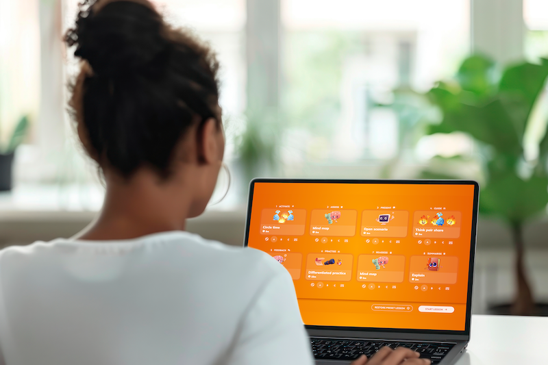
By this point, we had a clearer sense of how the lesson plan should look and feel, but we were still left with one major challenge. How were we going to make sure that we gave teachers details for all 24 possible activities per lesson, without overloading them with information or exceeding the two-page maximum we’d set ourselves?
We took inspiration from the work we do on e-learning courses. One solution we’ve found helpful when we’re trying to organise large amounts of information is a tabs interaction: learners can open the information they need, when they need it, and keep everything else tucked away. This approach helps reduce cognitive overload by breaking content into manageable chunks, and by giving users control over what they see and when they see it.
That’s when we turned to interactivity. In InDesign, interactive elements rely on ‘actions’, which are triggered by buttons, and although we’d worked with them before, this needed something more advanced. After a bit of reading and some experimentation, we figured out the right combination of show/hide actions.
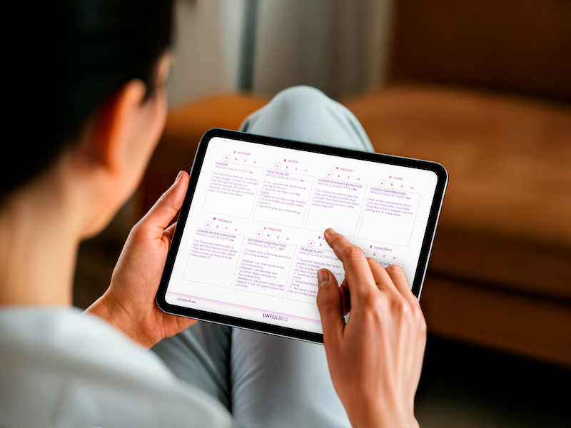
This solution gave us exactly what we had hoped for our lesson plan: with four clickable buttons for each of the eight parts of the lesson, teachers can toggle between the three ready-made activities or select the custom icon to type in their own ideas. When an option is selected, only that activity is displayed, and the rest are hidden from view. Finally, we had what we wanted.
Ready to see it in action for yourself?
We know how challenging it can be to teach a lesson or deliver a session that you haven’t planned yourself. That’s why getting the lesson plan just right felt so important. It’s a central part of our PSHE curriculum — designed to make things easier for teachers, not harder — and we’ve worked hard to create something clear, straightforward, genuinely useful, and free.
If you’d like to explore our lesson plans and see the full lessons in action, they’re all available to access for free at www.unfoldeducation.com. Whether you’re keen to try our resources for yourself, or you’re interested in sponsoring one of our units and helping us continue to offer free, interactive, customisable PSHE lessons to schools across the country, we’d love to hear from you.